
One Line a Day – A Microjournaling App for Self-Awareness Through Patterns
One line a day is a micro-journaling app designed to help users uncover emotional, astrological and psychological patterns using AI-powered analysis, astrology, dream analysis, lunar cycles, Chinese elements and Jungian Psychology. I led the product strategy and UX/UI design, working closely with the founder to translate a deeply personal vision into a usable, elegant dark-mode interface. The app allows users to journal in short daily entries and receive meaningful, personalized insights — like recurring moods, phrases, or emotional peaks tied to full moons or Yang Fire days.
Collaboration with Development
We followed a lean, iterative process from day one — working in parallel to accelerate development without compromising on design quality. While I built the design system and core flows in Figma, the developer began implementation immediately. This allowed us to test components in real contexts, spot usability issues early, and adapt quickly — rather than waiting for a full design delivery. We worked in short, focused sprints, often exchanging feedback via Loom videos that documented our thought processes and helped us learn from each other’s approaches. I am also using no-code and visual tools like Bolt to prototype and validate interactions, teaching myself new technologies while shaping the product hands-on. The workflow was flexible, transparent, and energizing — more about shared ownership than handoffs.
You can see the video here!
The Challenge
The client approached me with a powerful and unconventional idea:
“I want people to micro-journal and discover meaningful emotional patterns — with the help of astrology, psychology, AI, and Eastern wisdom.”
This wasn’t going to be just another journaling app. The goal was to design a soft, intuitive space where users could write short daily reflections and receive insight that is based on their post entries— not generic. We needed to find a way to show deep emotional trends, like recurring moods or thought loops, and connect them to natural cycles such as moon phases or the Chinese five elements — without overwhelming the user or slipping into pseudoscience.
On top of this, we wanted the experience to feel calm, emotionally intelligent, and trustworthy — especially when AI was used to surface insights from personal text. This required thoughtful UX decisions, strong visual hierarchy, and full transparency throughout the design.
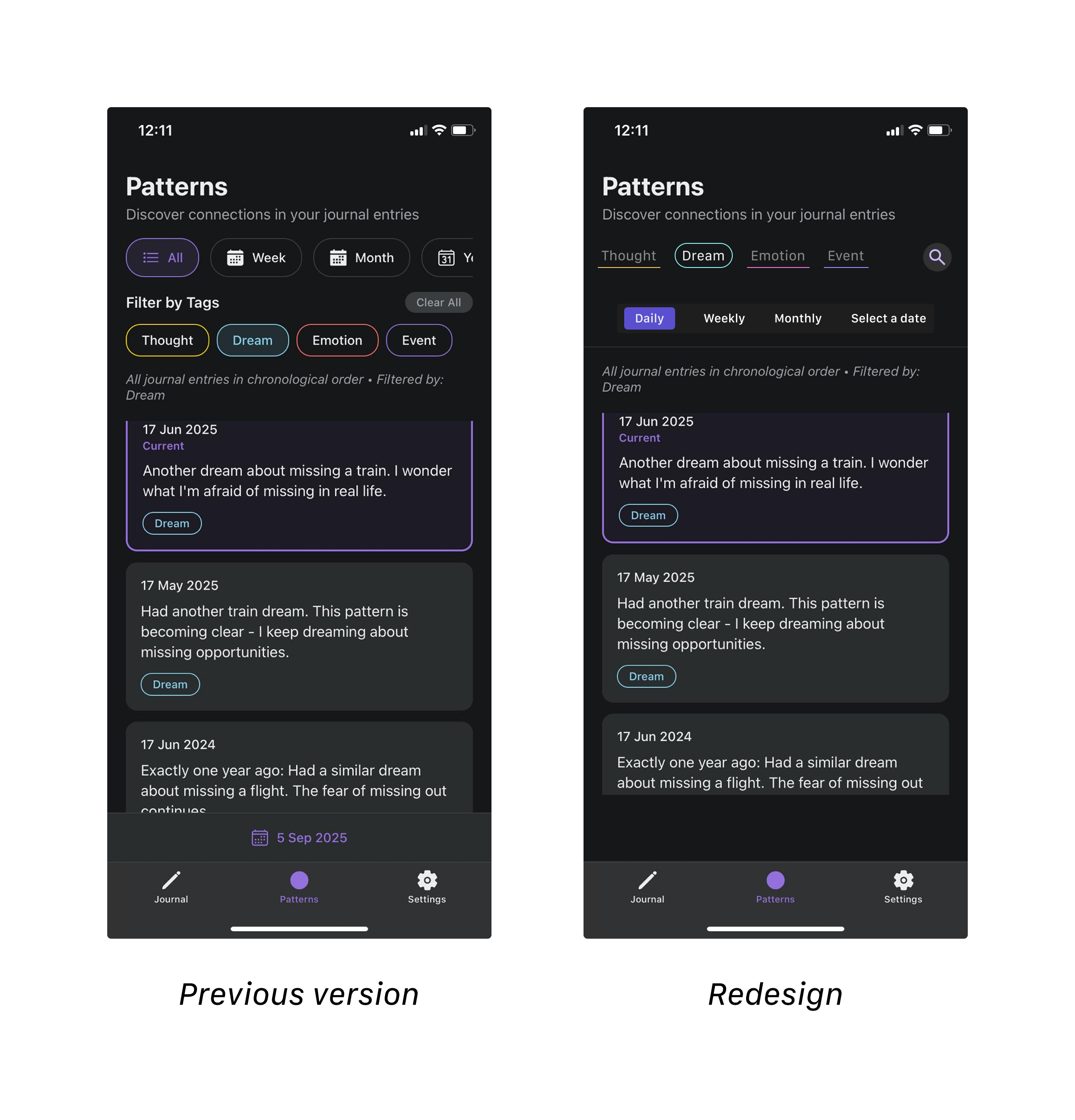
Challenge – Evolving Scope and Redesign
As the founding designer, I knew from the start that the vision for One Line a Day would evolve rapidly. Early on, we focused heavily on AI-powered insights, where the app would automatically analyze journal entries to surface recurring emotional patterns and meaningful connections.
However, midway through development, the founder decided to delay the AI component to launch faster with a simpler MVP. This meant a major pivot: instead of automatically generating insights, users would manually track and explore their own patterns, with AI becoming a future enhancement.
This was a turning point for the project. It required me to redesign the core flows and interfaces, while the developer was actively building the product — a situation that brought unique challenges:
Shifting priorities: Determining which features to keep and which to delay without losing the essence of the product.
Redesign under development: Updating designs while the developer was already implementing earlier versions.
Balancing user value with feasibility: Ensuring the app still felt meaningful without AI automation.
My Approach
1. Reframing the MVP
I collaborated with the founder to redefine the minimum viable product, focusing on the essentials:
Effortless micro-journaling,
A clean timeline of entries,
Manual pattern tagging and filtering.
By stripping down to these core elements, we could still deliver value while keeping future AI integration in mind.
2. Simplifying the Flow
The earlier design had been optimized for AI-driven features and was too complex for the new direction.
I:
Removed unnecessary steps,
Reduced navigation complexity,
Streamlined the main screens so users could quickly write, review, and reflect.
Goal: Create a calm, frictionless experience that encourages frequent journaling.
3. Improving Communication with Development
At one point, the developer implemented changes independently due to unclear communication, resulting in:
Overly cluttered layouts,
Poor visual hierarchy,
Too many actions competing on a single screen.
To fix this, I:
Tested the build with a few potential users to identify usability issues,
Created a clear usability issue list with screenshots and priorities,
Introduced daily check-ins with the developer and founder, similar to standups, to prevent future misalignment.
This process not only resolved immediate problems but strengthened team communication.
4. Redesigning for Clarity and Scalability
The pivot forced me to rethink the design system so it could support rapid iteration:
Modular components for quick updates,
Simplified color palette and typography for a calmer aesthetic,
Atomic design principles to prepare for future AI-powered features.
By doing this, we preserved long-term scalability while staying lightweight for the MVP
Understanding the Users
To ground the experience in real needs, I spoke with journaling enthusiasts, astrology app users, and a few curious skeptics. What I discovered shaped the product direction deeply.
Most people loved astrology, but felt many apps were too vague or aesthetic-driven.However 5 out of 6 told me they are using Co-star and Pattern.
Many journalers had no idea how their mood was shifting over time, and were curious about tracking it — but didn’t want anything clinical or "productivity"-driven.
Chinese elements and moon cycles were new to some, but felt intriguing when explained in context.
Most importantly, people wanted insights that felt relevant — not random horoscopes or mood charts without soul.
These conversations helped define the tone: gentle, grounded, reflective — not flashy or too “spiritual.” It also led to key features like meaningful pattern cards, emotionally intelligent prompts, and the ability to turn certain insight categories on or off.
Competitor scan

I looked at two apps that the potential users mentioned in particular to understand gaps and opportunities:
Pattern: Beautifully designed but emotionally overwhelming. No space for journaling.
Co-Star: Strong on astrology, but too impersonal. Its tone felt cold or distant to users.
The insight? Most tools were either data-heavy but disconnected (like Co-Star). None combined writing, emotion, and intelligent patterning the way this app aimed to. That gave us a unique positioning: helping people understand themselves through their own words, powered by AI and symbolism, but always grounded in empathy.
But their design choices was something I added to my moodboard for design later
Hypothesis
We believe that by combining short-form journaling with personalized insights from astrology, Chinese elements, dream analysis, Jungian Psyhology and AI-driven analysis, users will become more emotionally aware and feel more connected to their own patterns over time.
Goals
Enable users to journal effortlessly in a calming, low-friction space
Help users surface meaningful emotional and behavioral patterns from their entries.
Deliver insights that feel personal, accurate, and emotionally intelligent — not generic or overwhelming
Create a modular design system to support fast iterations and future growth
Build trust through transparency around how patterns are detected and displayed( especially with AI)
A Personal Goal
While studying the Carbon Design System by IBM, I was amazed by how they were very transparent about their use of AI. They have different colors, for AI based content- and I believe it is our responsibility to let users know that some content is AI Generated.
This was something I pursued on this app- I added a color for AI to my design system and used that on cards when the content of the card was generated by AI.
App Flow

A Challenge: Making Meaning from Chaos
The most difficult — and most important — part of the project was designing the Pattern Cards. These cards are the core of the app’s value, and the challenge was balancing depth vs. clarity. I had to decide:
What types of patterns truly matter?
How can we decide which
How do we visually separate “important insights” from lighter patterns without overwhelming the user?
What kind of data visualizations support the insight without feeling clinical?
How do we stack cards so users can quickly skim — but still want to explore deeper?

After testing multiple layouts, I created a two-tiered card system: medium and high-importance insights, with subtle differences in color and layout. Each card could be expanded to show deeper AI-generated analysis, but only when it felt worth it. I also developed a visual system of icons and tags (e.g. Lunar, Psychology, Dream) to signal what type of intelligence was powering each card.
This became the emotional heart of the app — and took the most creative and strategic energy to get right.
Design System
To scale fast and stay consistent, I created an Atomic Design System:
Color Tokens: Semantic + Functional (e.g.
color-bg-dark,color-insight-ai)Typography: 4 styles tuned for emotional tone
Icon Set: Astrology, Dream, Psychology, Lunar, Chinese Elements, AI
Components: Pattern Cards, Pills, Graph Styles, Emotional Forecast Modules


Here I used atomic design system and created cariables for atomic and semantic colors- also for radius, font-size and spacing to make changes fast later since this it the first version of the app


Expected Metrics and Conclusion
Even for V1, we scoped KPIs for future iterations:
🧠 % of users who expand pattern cards
✍️ Frequency of journaling before/after prompts
💬 Positive sentiment in feedback around emotional accuracy
🔁 Retention over 14-day streak
This project was more than a design challenge — it was about emotional UX.
I combined my love for astrology, psychology, and systems thinking into one cohesive flow.
Next steps:
Prototype with Bolt and test it with users
Add like/dislike buttons on AI generated content to test with users
Refine visualizations with real-time graphs